


UX Strategy & SaaS
June 2026

Web3 & Digital Ethics
June 2026


SoraAX is a full-service digital partner focused on building scalable platforms, intelligent automated workflows, and user-centered products for ambitious, forward-thinking companies.

Our process is lean, iterative, and collaborative focused on solving complex business problems with smart architecture and validated research, not just adding decoration.

We have built a resilient, high-performing team of UI/UX designers, full-stack developers, and AI/ML engineers dedicated to powering your next phase of digital growth.
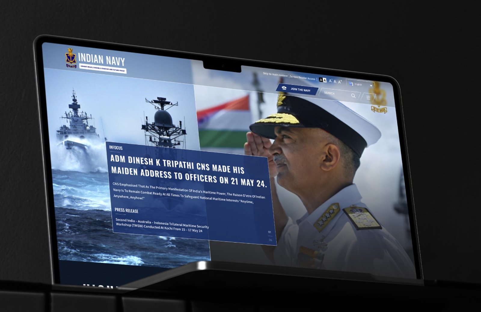
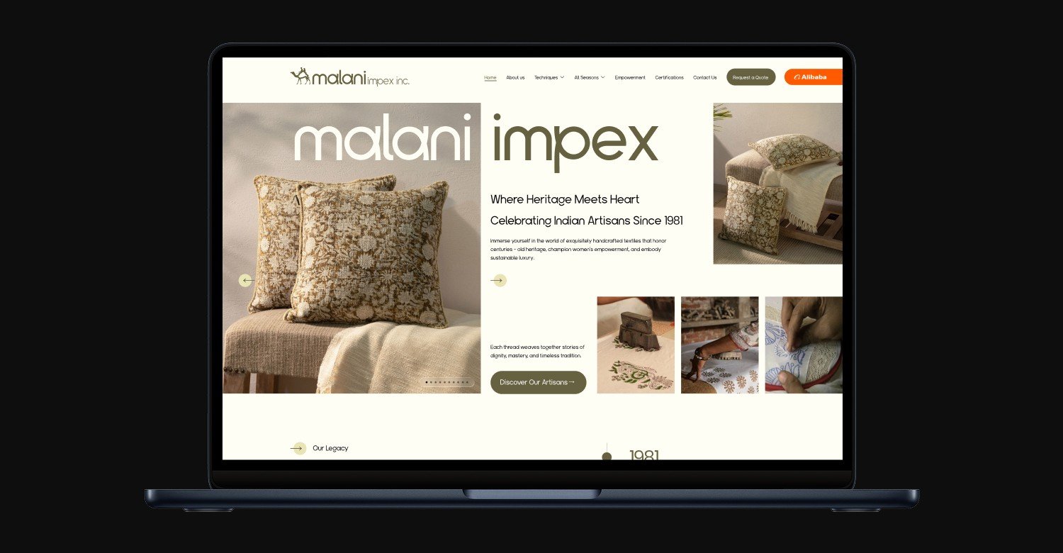
A modern, accessible, and mobile-responsive digital ecosystem designed to streamline navigation, improve civilian access, and reflect the dignity and rigor of India's naval forces.
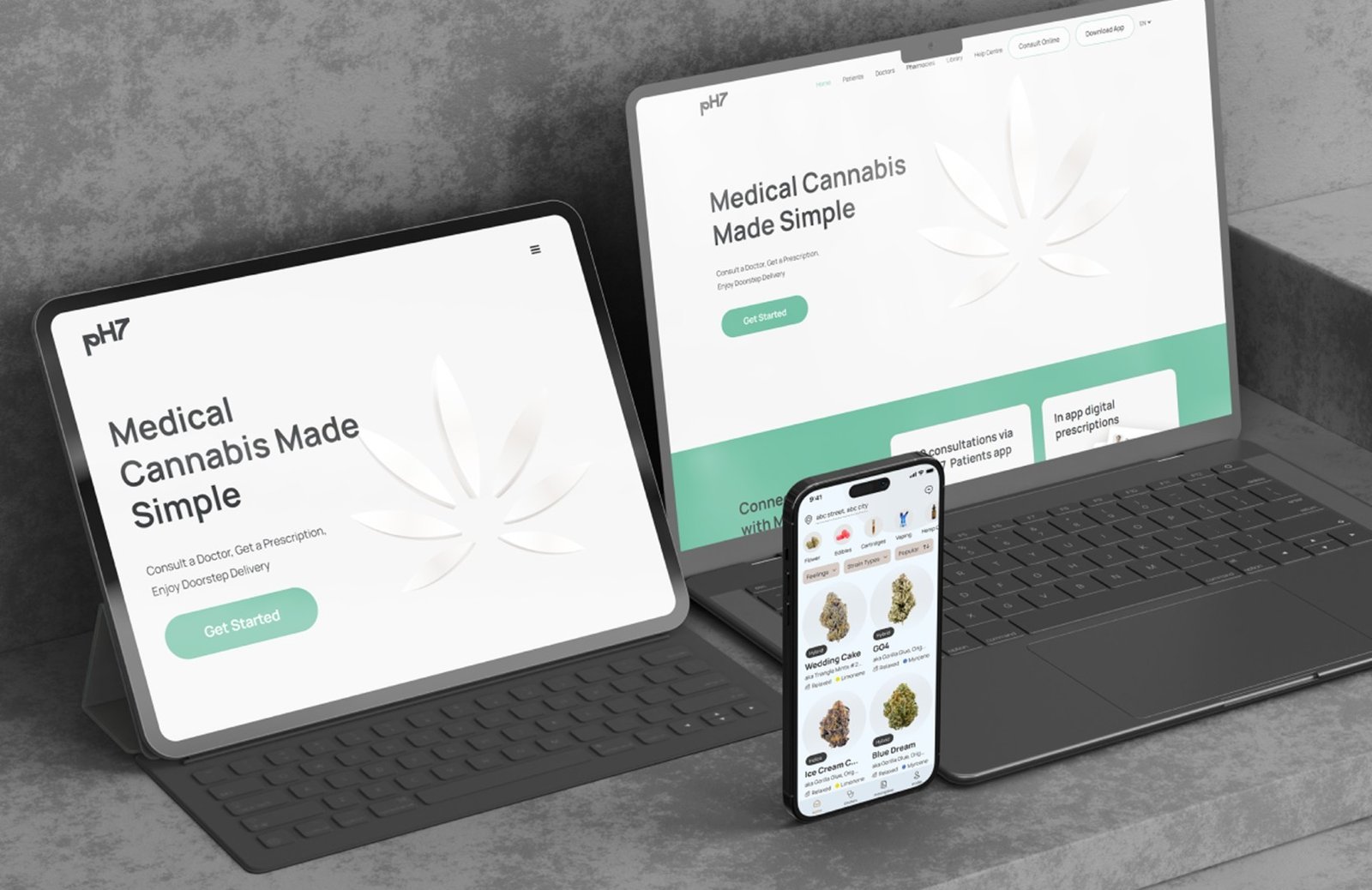
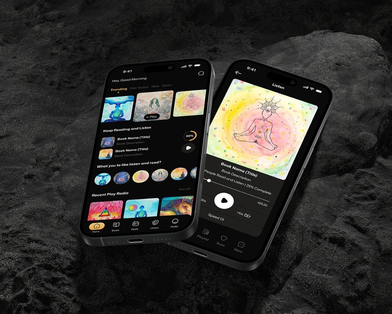
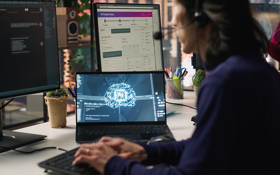
A unified, cross-platform healthcare experience connecting patients, doctors, and pharmacies. Intuitive UI flows bridge the digital gap, enabling quicker consultations and seamless prescription coordination.
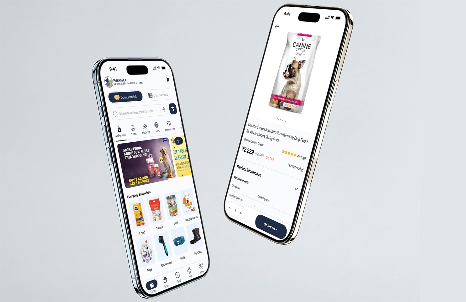
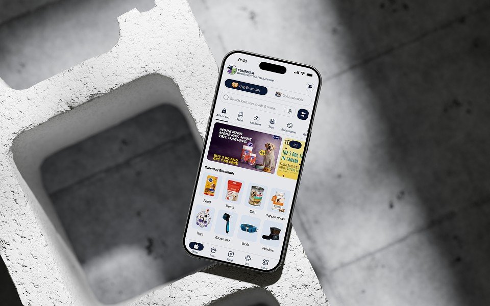
A full-stack, all-in-one pet care ecosystem combining e-commerce, an AI chat assistant, and vet services. By unifying fragmented tools into a single intuitive platform, it empowers pet parents to seamlessly manage daily wellness, training, and community engagement.

Human-centered design that drives engagement and conversions. We craft intuitive interfaces that reduce friction and turn complex digital interactions into seamless user experiences.
Scalable web and mobile app development built for high performance. We engineer robust digital products from MVP to enterprise-grade platforms optimized for speed and reliability.
Data-driven marketing strategies that build brand authority. We optimize visibility and focus on conversion performance to generate consistent, measurable growth.

Custom machine learning models & intelligent workflows paired with rigorous quality assurance. We automate manual processes, accelerate performance, & identify defects early ensuring every release is stable, secure, and highly scalable.
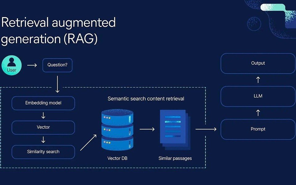
Production-ready retrieval-augmented generation systems. We connect large language models directly to your proprietary business data, delivering secure, context-aware AI assistants that provide accurate, verifiable answers instead of generic responses.
We begin by deeply understanding your business objectives, target audience, and technical requirements to define a strategic roadmap aligned with your growth goals.
Our engineers and designers bring validated concepts to life. We build scalable architectures, integrate custom AI/ML models, and write clean, performant code tailored to your ecosystem.
Translating strategy into structure, we develop high-fidelity wireframes and interactive prototypes to validate user flows, reduce friction, and finalize the UX before a single line of code is written.
We ensure a flawless launch through rigorous QA testing. Post-launch, we provide continuous monitoring, performance optimization, and dedicated support to keep your product scaling smoothly.

"The complete redesign of our website, admin panel, and mobile apps delivered an intuitive, visually stunning, and highly streamlined digital ecosystem. It is exactly the inclusive and accessible experience our diverse user base required."


"The redesign of the Indian Navy website drastically improved navigation and accessibility. It delivers a modern, robust user experience that honors our institutional values while providing personnel and civilians with seamless access to critical information."

"Working with SoraAX was a game-changer. The redesigned Teesas app is intuitive, visually engaging, and highly accessible, completely transforming how students across Nigeria interact with our learning platform."